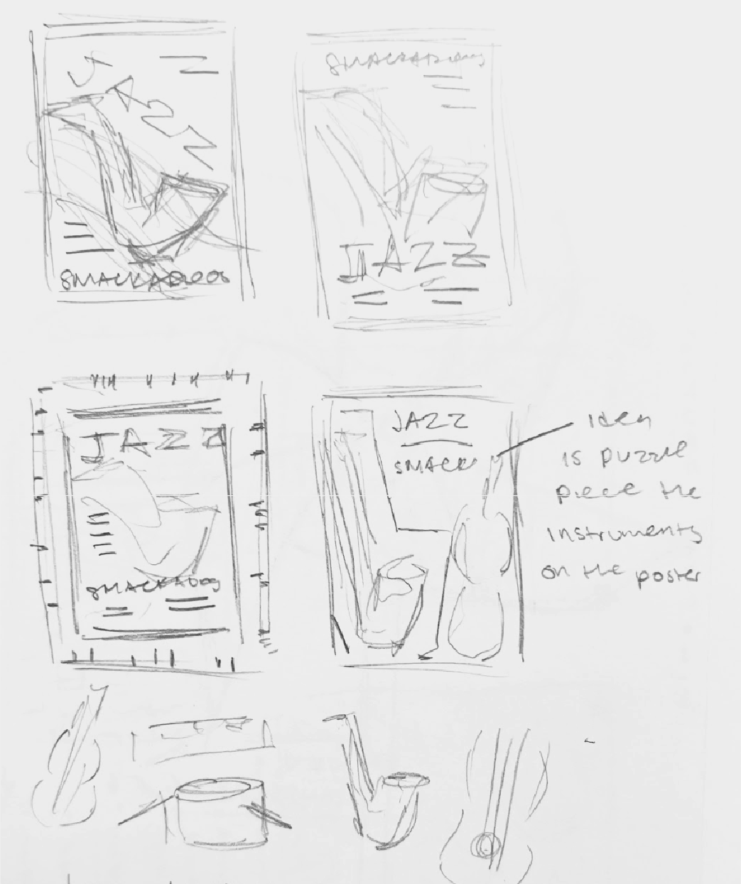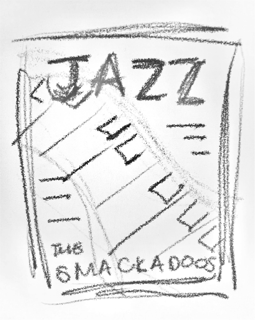
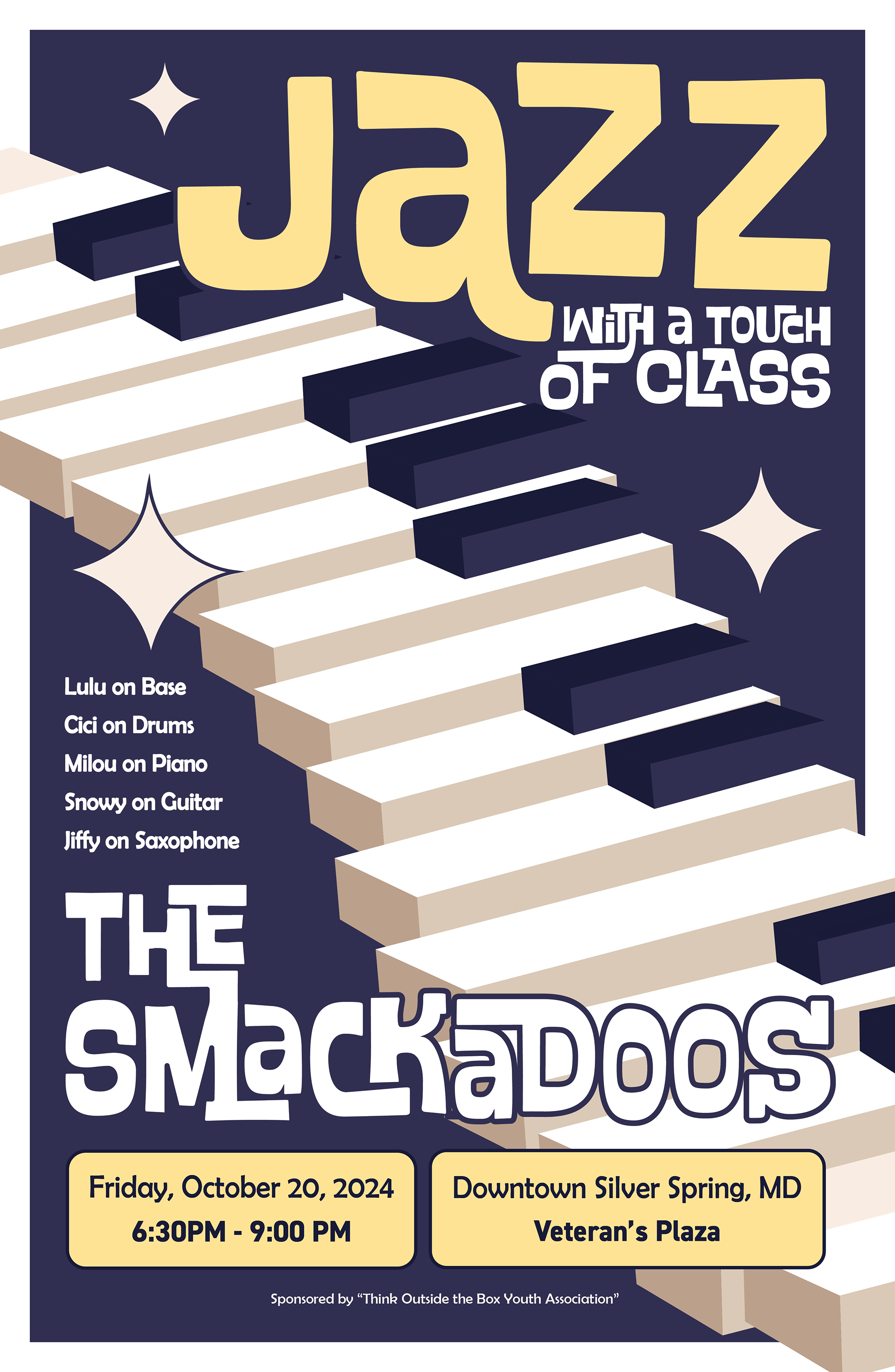
DESIGN PROCESS
I began this process by sketching several poster ideas before landing on this design. I primarily focused on text location, but I chose to utilize a piano because it allowed the most flexibility in terms of movement and composition for the piece. Though I have used Illustrator for several projects in the past, making the piano was one of the more difficult aspects of the project because I struggled with the perspective and overlap. This was also the first time where I got to experiment with typography. I thought the original font matched well with the vibe, but I did connect some of the letters for more cohesivity. The colors were one of the last aspects that I dealt with. I knew that I wanted navy blue to be one of the core colors because I associate it with the night and jazz, but the yellow accent and white border were things that I added last minute. I thought that the border gave it a more complete look and added more depth to the piece. Overall, this assignment allowed me to expand on my previous knowledge of the software by using new techniques.