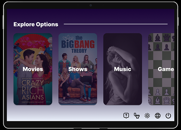
Airplane bathroom availability is uncertain, and there is no way to predict when one becomes free to use. Passengers must then monitor the door, either from their seat or by the bathroom, which can lead to frustration and congestion. For this project, I was tasked to design a digital airplane bathroom queue that is integrated with typical in-flight entertainment systems.
Digital Prototype
Design Process
EMPATHY
After being assigned this task, I spent some time reflecting on possible problems and situations to consider while designing. During this period, thinking about the queue list, being unable to to predict the length of the line, utilizing a map showing the bathroom location, a "cancel" feature, including the amount of time until passengers need to use their seatbelt, and the possibility of incorporating a messaging feature for passenger priority. My personal goal was to create a stress-free, easy experience that allows passengers to be efficiently notified.
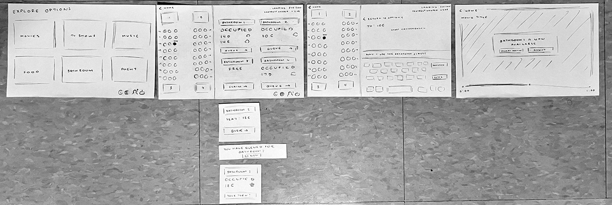
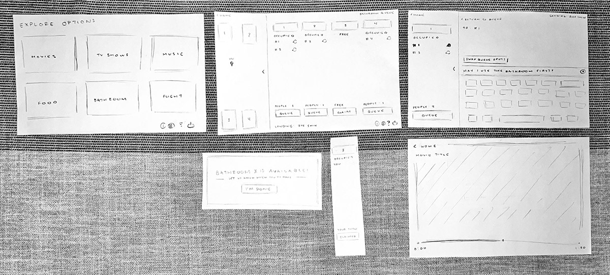
FIRST PAPER PROTOTYPE
My first prototype allowed the user to see a map of the plane to see which bathrooms are available and which ones are the closest. They would be colored green or red for a quick availability glance. The user is then able to see each bathroom queue and which seat is in the queue. In dire circumstances, the user is also given the ability to message the other users to state their case. Otherwise, the user is able to sign up for a spot using their seat number. If the bathroom is free, they are able to go immediately after. They can also remove their position on the list. If the bathroom is unavailable, they will receive a message when it is their turn. Another small feature is the time in the corner, indicating the time until landing. This can help users figure out when they want to go.
ADDITIONAL IDEATION
In order to build on our designs, we played a few rounds of "Worst Ideas," where I needed to transform the idea of having a monkey on the user's back to gain access to the bathroom. I thought about utilizing a key card that is ejected from the seat when it is the user's turn. There were several reasons as to why this feature did not make my final design, but I incorporated a similar idea by having the users report when they return.
SECOND PAPER PROTOTYPE
I had some difficulty with the feedback as several of my critiques contradicted each other. However, for the second paper prototype, I prioritized simplicity as a lot of the users spent a long time looking at the screen. I made the queueing process shorter because there was this one stage that all of my testers got stuck at. The main debate was having separate queues for the bathroom versus having one long line. I ultimately kept the separate queues, but I made them all vertical instead of a grid. I also removed the other seats on the map so that there is less to look at. In addition to simplicity, I implemented more privacy features. Instead of the seat numbers, each person will get a queue number.
FIRST DIGITAL PROTOTYPE
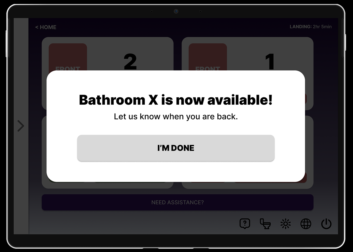
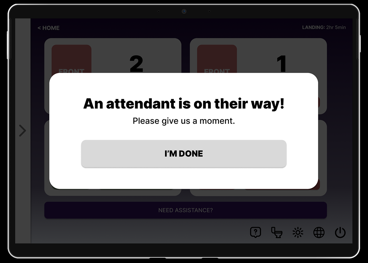
There weren’t that many changes from the second paper prototype to the low-fidelity digital prototype. Most of my feedback conversations were more so related to functionality and “what-if” scenarios such as a seat neighbor pressing the “I’m Done” button while the user is in the bathroom. I had discussed a “Do Not Disturb” feature and a possible “Need Assistance?” feature. It was also easier to showcase the collapsible map as well.
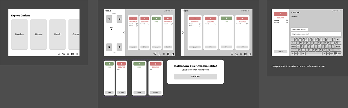
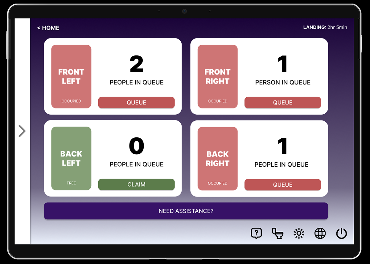
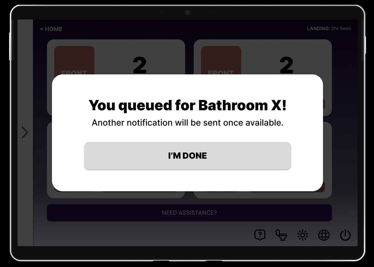
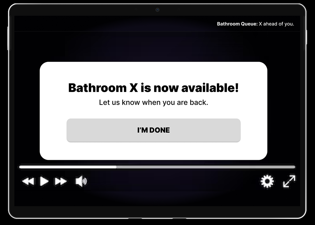
FINAL DIGITAL PROTOTYPE
I presented my prototype to the class and there were a few suggestions / questions to consider. Someone suggested multiple ways for users to reach the restroom queue. There were also some privacy concerns with the messaging feature and the possibility for harassment. This may require additional moderation. If I wanted to keep this feature, it was suggested that I could incorporate pre-filled responses. A separate suggestion was the importance of labelling people.. My final prototype changed quite a bit from the first digital iteration. I ultimately got rid of the messaging feature in the final version and focused on the “Need Assistance?” feature. Because of this, I played around more with the layout and ultimately reverted back to my grid layout from the first paper prototype to reflect the bathroom positions. I also utilized the feedback of friends to help finalize this flow. If I had more time to implement, I would continue to play with the colors to see how I can make it look more professional. I would also like to add more prototype features to make it feel more realistic.